Purchase platform redesign
Role Product Designer, UX Writer
Team 1 PM, 2 FEDs
Timeline ~3 months, 2025
Company Wix
Problem
Wix's internal purchase platform - where product teams define everything Wix users see, pay for, and get access to - had been locked to a small group of specialists for years. Any PM who needed to change a product had to go through them. That meant tickets, waiting, and a platform team spending its time on requests instead of building.
Solution
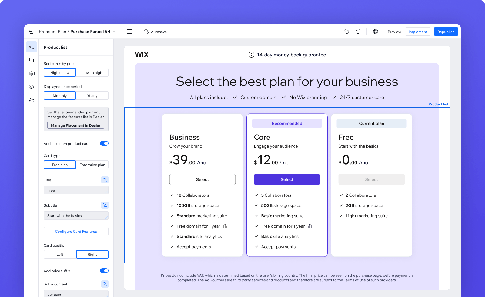
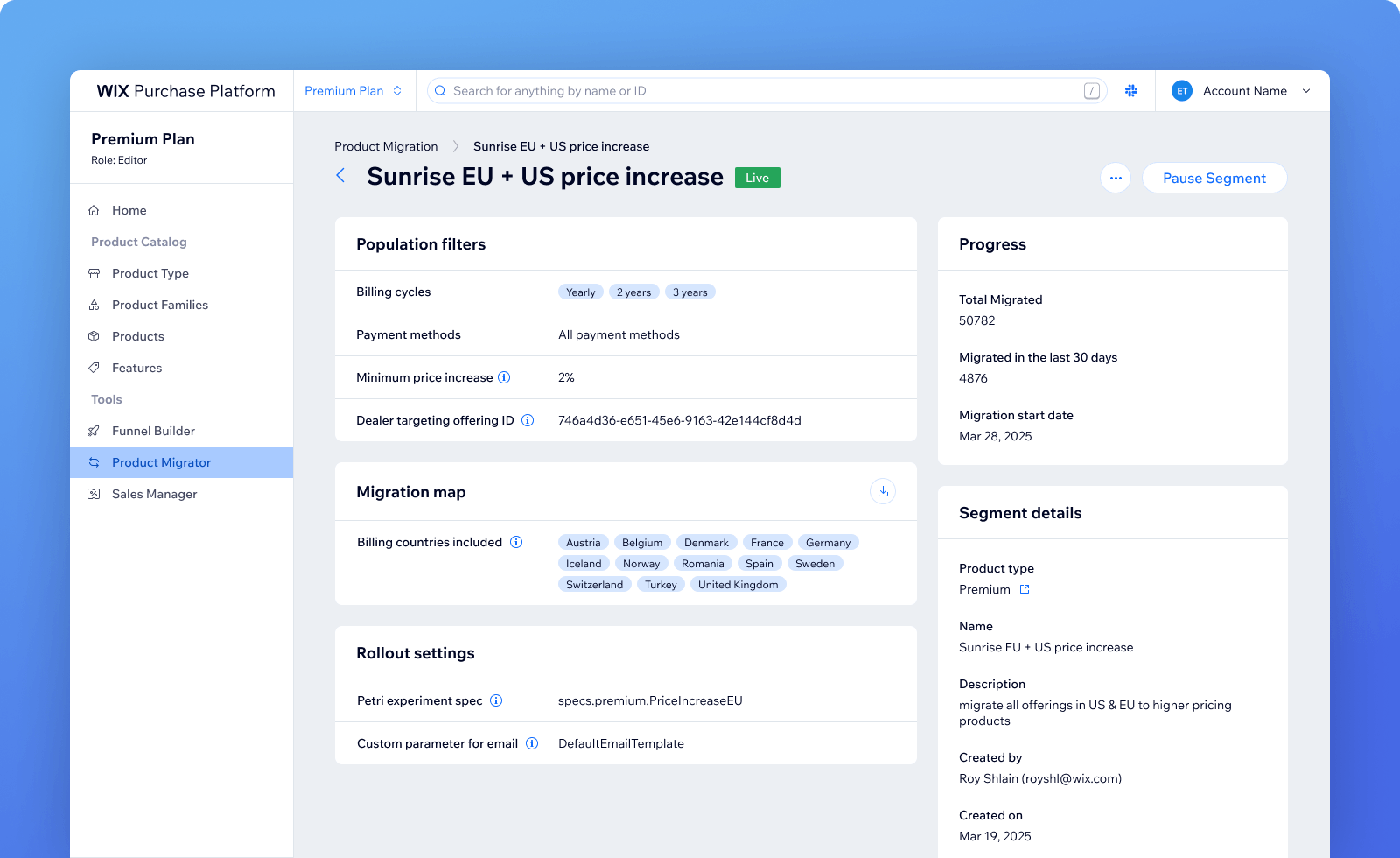
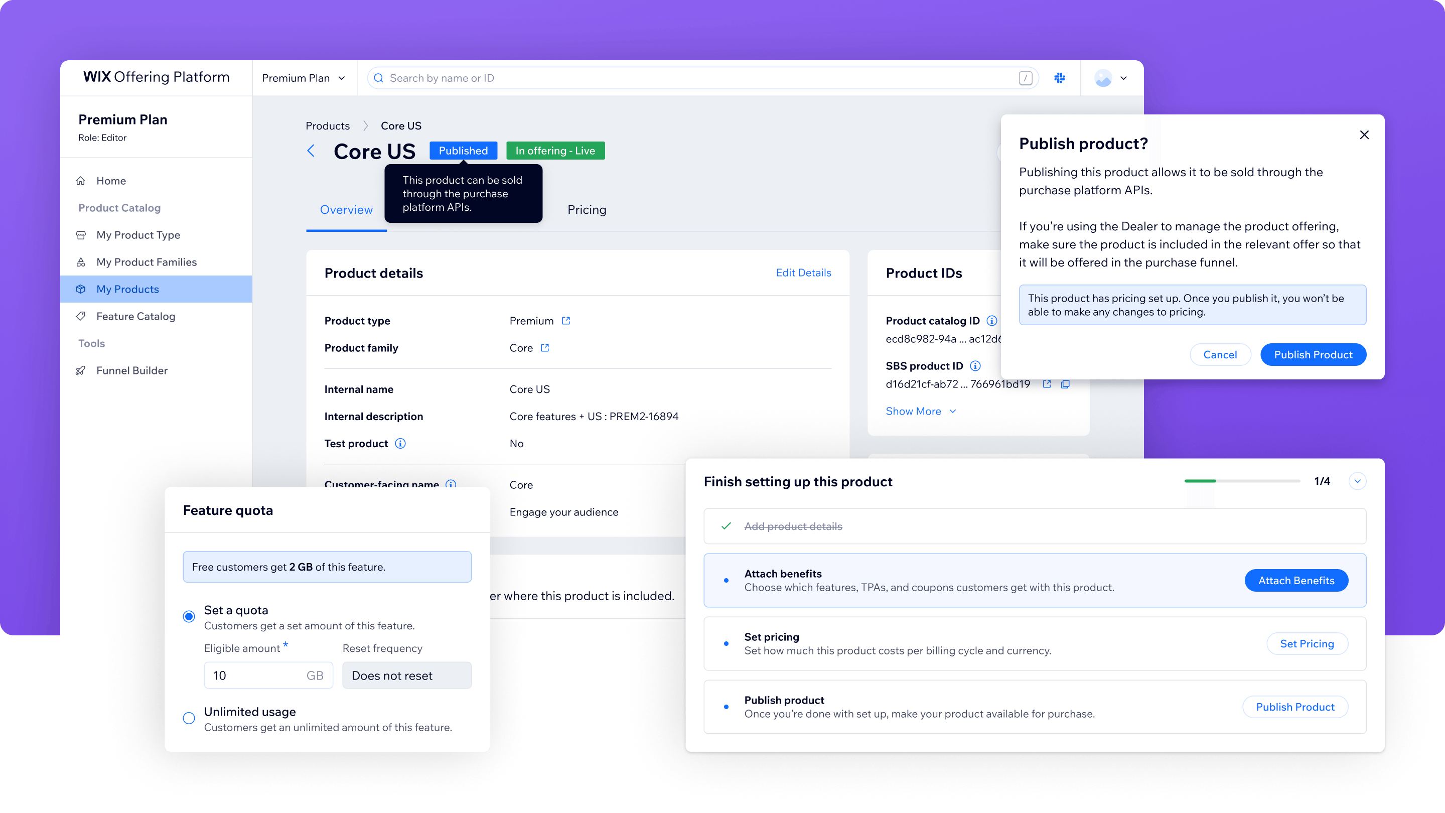
A redesign to the platform's core UI for self-service: the product table, product page, settings, and benefits configuration. Improved information hierarchy, surfaced hidden context, and added guardrails for actions with real consequences.
Impact
Product managers across Wix can now create and configure products independently, and are more directly connected to the business decisions behind them.
Every product Wix sells runs through here
Wix sells a lot of products - Premium plans, domains, Google Workspace, Studio, AI tools, and more. Every one of them is defined in a single internal platform where product managers configure what Wix users pay for and what they get: price, billing cycle, features, business model.
Once a product is live and subscriptions are running, this data gets read constantly - during checkout, during feature entitlement checks, at renewal, at cancellation, etc - it's referenced throughout the entire subscription lifecycle.
Given how much depended on it, and that a wrong change on a live product could cause a production incident, access was tightly controlled. For years, the platform was only operated by the team that built it.
The platform team was every team's dependency
Every PM who wanted to configure a new product, update pricing, or attach a feature had to file a request and wait for developer availability. For a company accelerating on new products and monetization initiatives, this was a real bottleneck. The platform team spent its time running tickets instead of improving the system.
The goal was to make the platform self-service - we wanted to make it genuinely usable by product managers without technical background, and safe enough that a wrong move wouldn't cause a production incident.
Starting with the people who already knew the system
Before redesigning anything, we talked to the employees who had been working inside the platform - the specialists who'd been operating it for years. We wanted to understand how they worked, what slowed them down, where they got stuck, and what the UI failed to explain.
We also went through our support channel - since all requests came through us, it was a clear picture of what people needed most and what was most confusing.
After launch, we didn't open the platform to everyone at once. We started with a small group of consumers to collect feedback and fix the things that weren't clear before broader rollout.
Product page - layout and guidance
The product page is where most configuration happens. It needs to show you where things stand, what's still missing, and what each setting actually means.
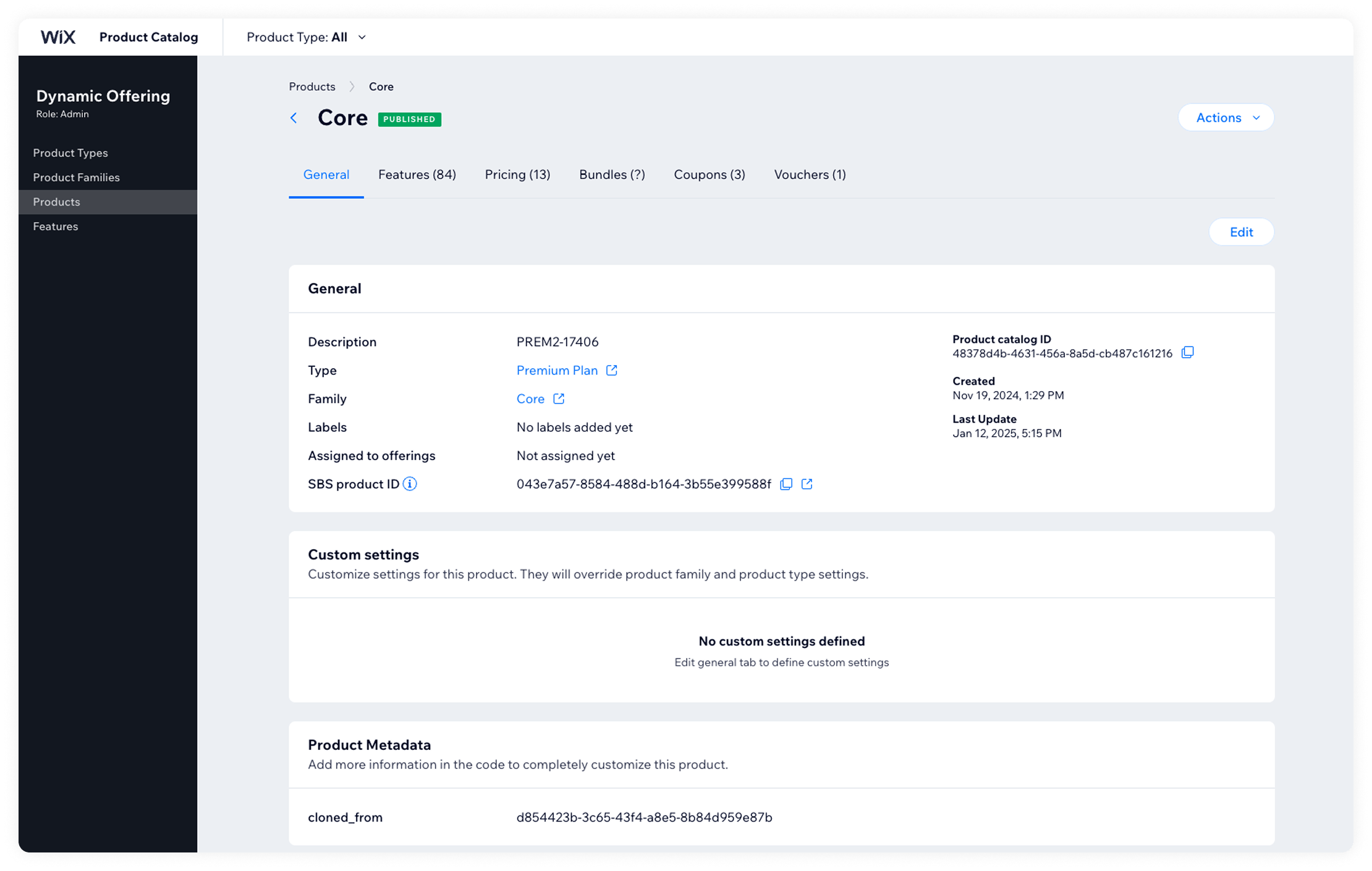
Before
- Most information was buried under a single "General" tab - the layout didn't reflect the actual structure of a product
- No indication of what still needed to be configured
- Several tabs were nearly identical in purpose - it wasn't clear where to look for what
- Key information like production status and product IDs wasn't visible anywhere
After
- Reorganized the layout and information hierarchy so the page scans clearly
- Added a widget that surfaces what still needs to be configured and explains what each action does
- Merged three tabs that overlapped in purpose into one
- Surfaced information that wasn't there before: production status, relevant IDs, and a per-product audit log
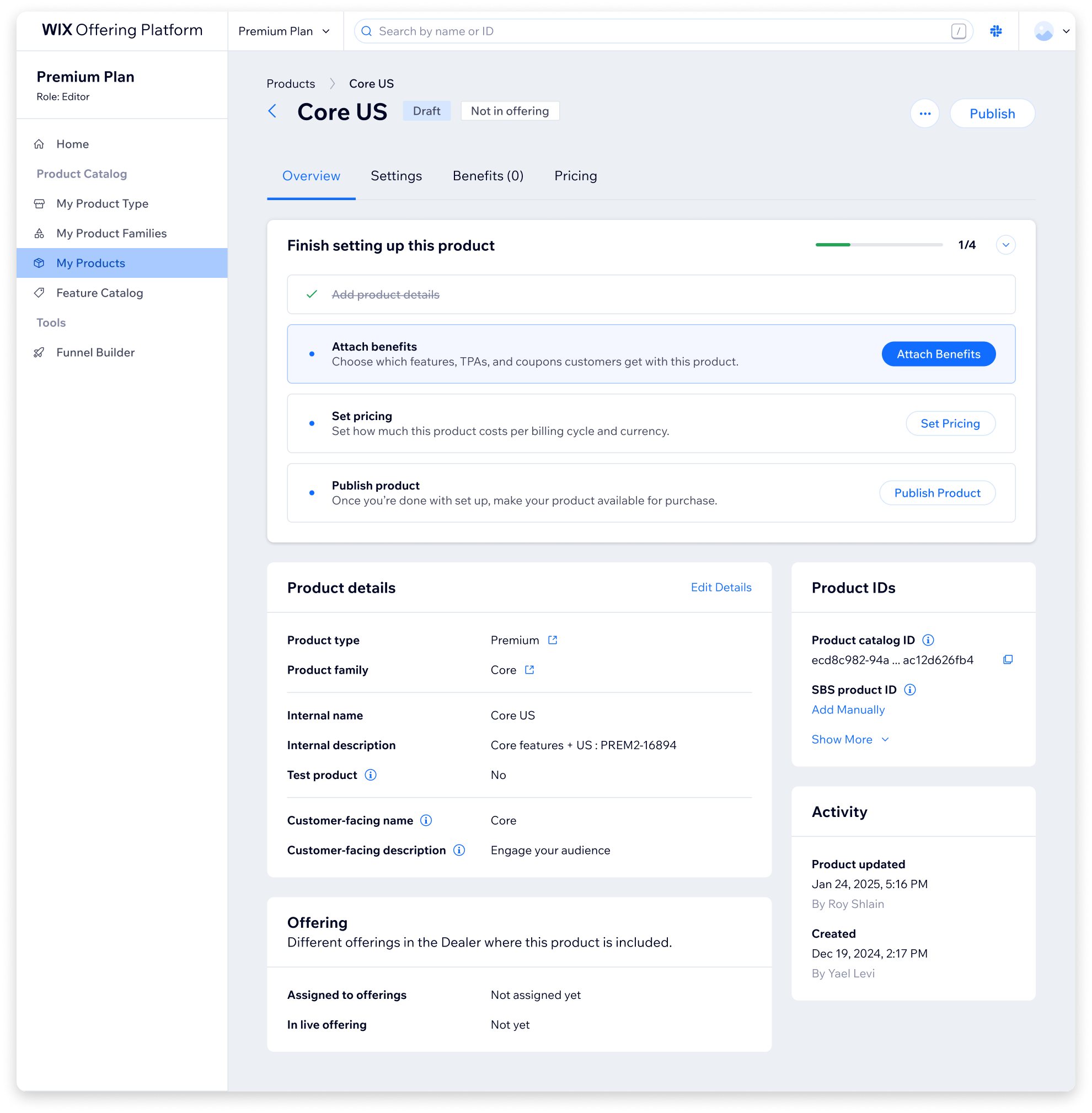
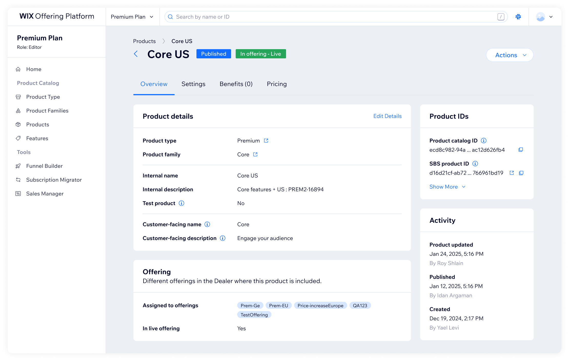
For every action with real consequences, we added a modal that explains exactly what's about to happen before it does. Given the stakes, that friction is intentional.
Product settings - the inheritance model
Each product inherits defaults from global vertical settings, with the option to override them as needed. This inheritance model is central to how configuration works - but it wasn't visible anywhere.
Before
- No explanation that this model existed at all
- To check current defaults, you had to navigate away from the product to a separate settings page
- No contextual explanation of what each setting controlled
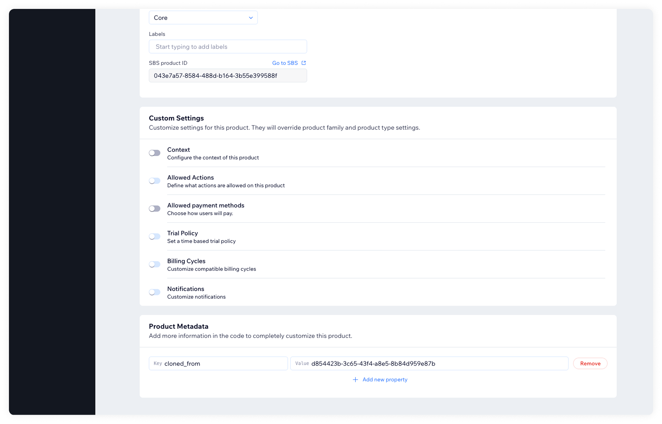
After
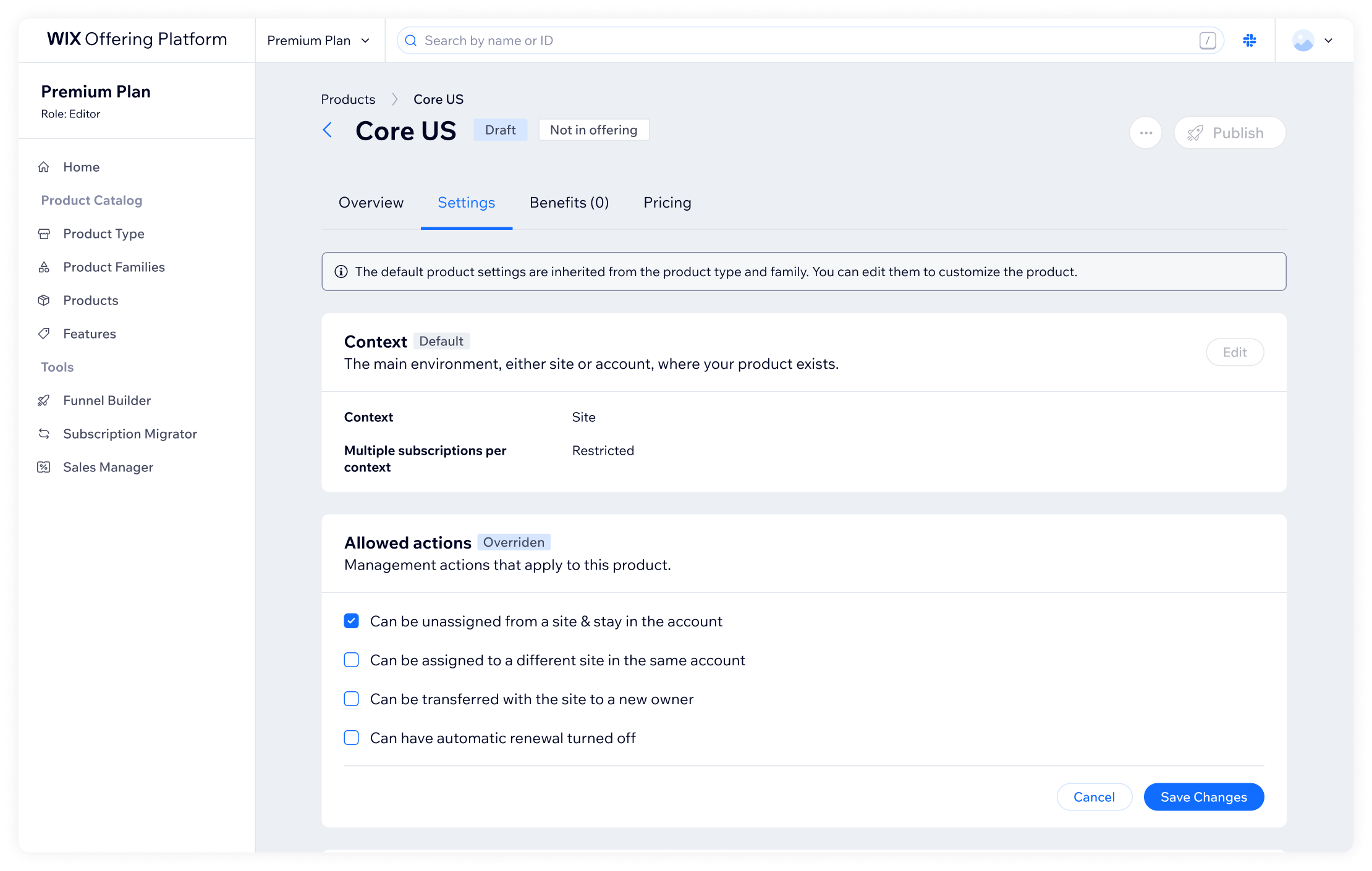
- Settings became their own tab, with an explanation of the inheritance model at the top
- Each setting shows its current state and whether it's using the default or has been overridden
- Added brief explanations per settings group - what it controls and why it matters
Product benefits - merging and clarifying
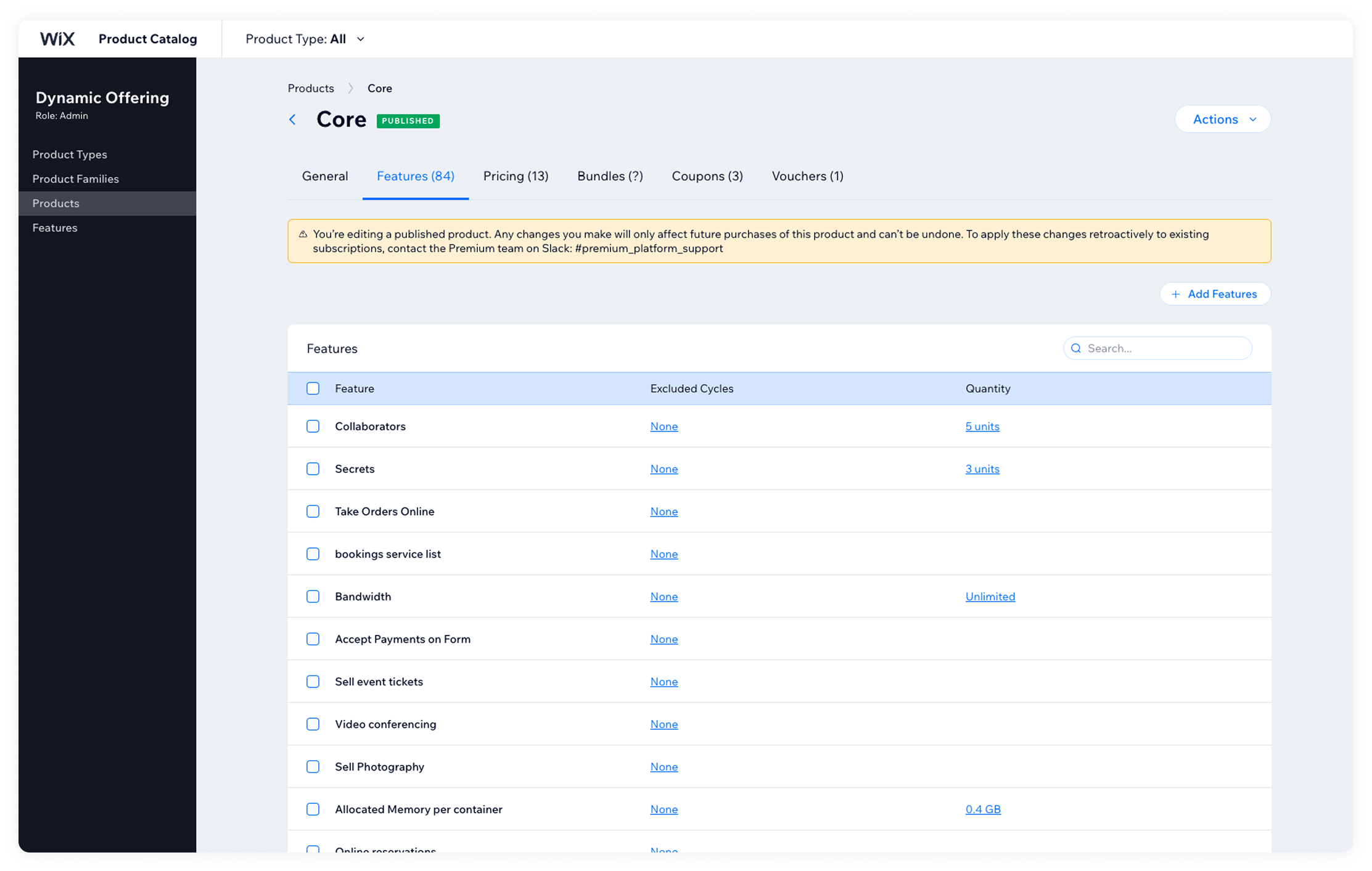
Products can have features, coupons, and vouchers attached. The distinction between the three was unclear enough that members of our own team weren't always sure. In practice, only features were actually used.
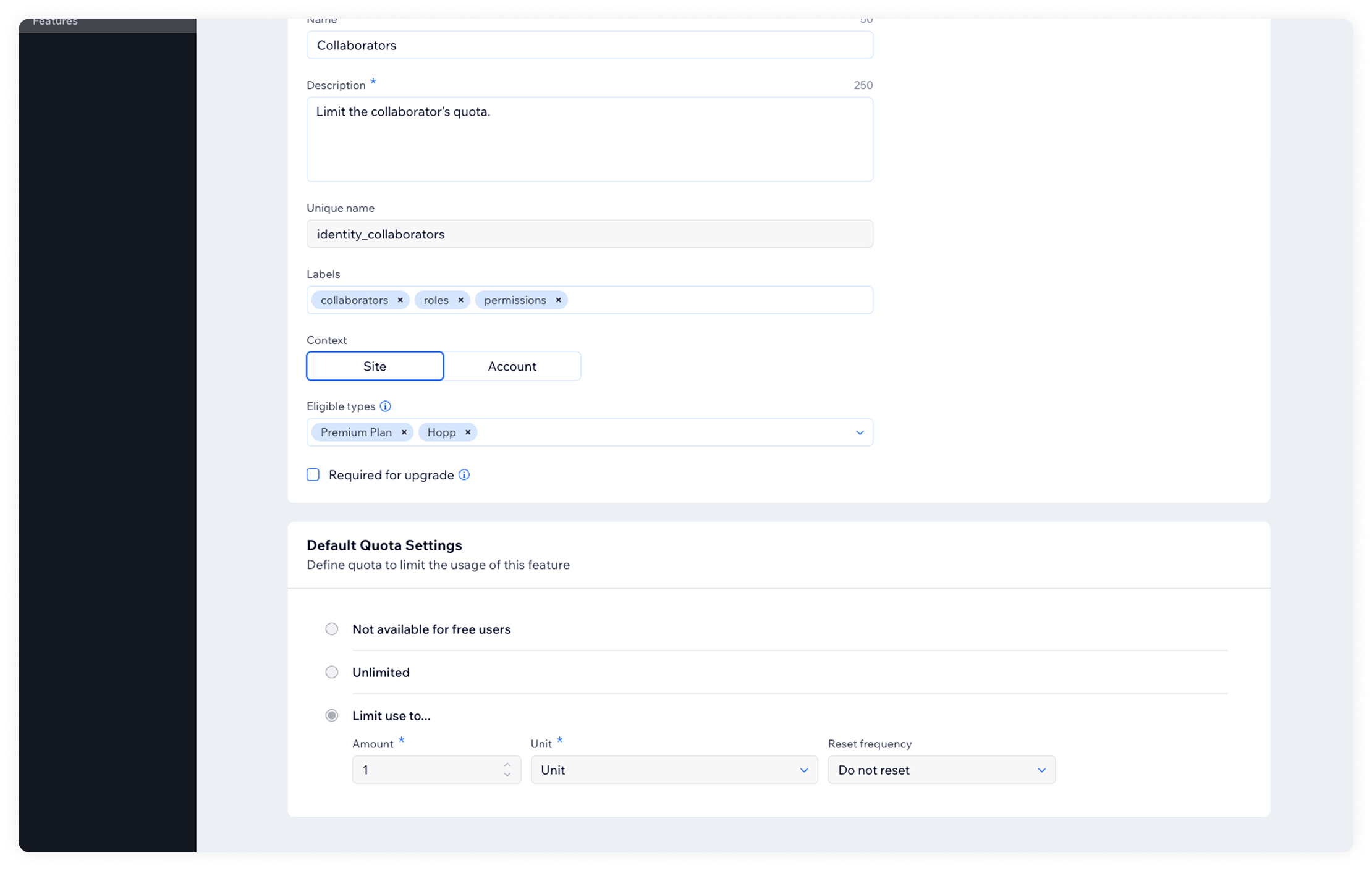
Before
- Three separate tabs with overlapping purposes and no explanation of the difference
- Attaching a feature with quota logic required configuring how much quota paying Wix users would receive - but the concept wasn't explained anywhere. Consumers had to figure it out themselves.
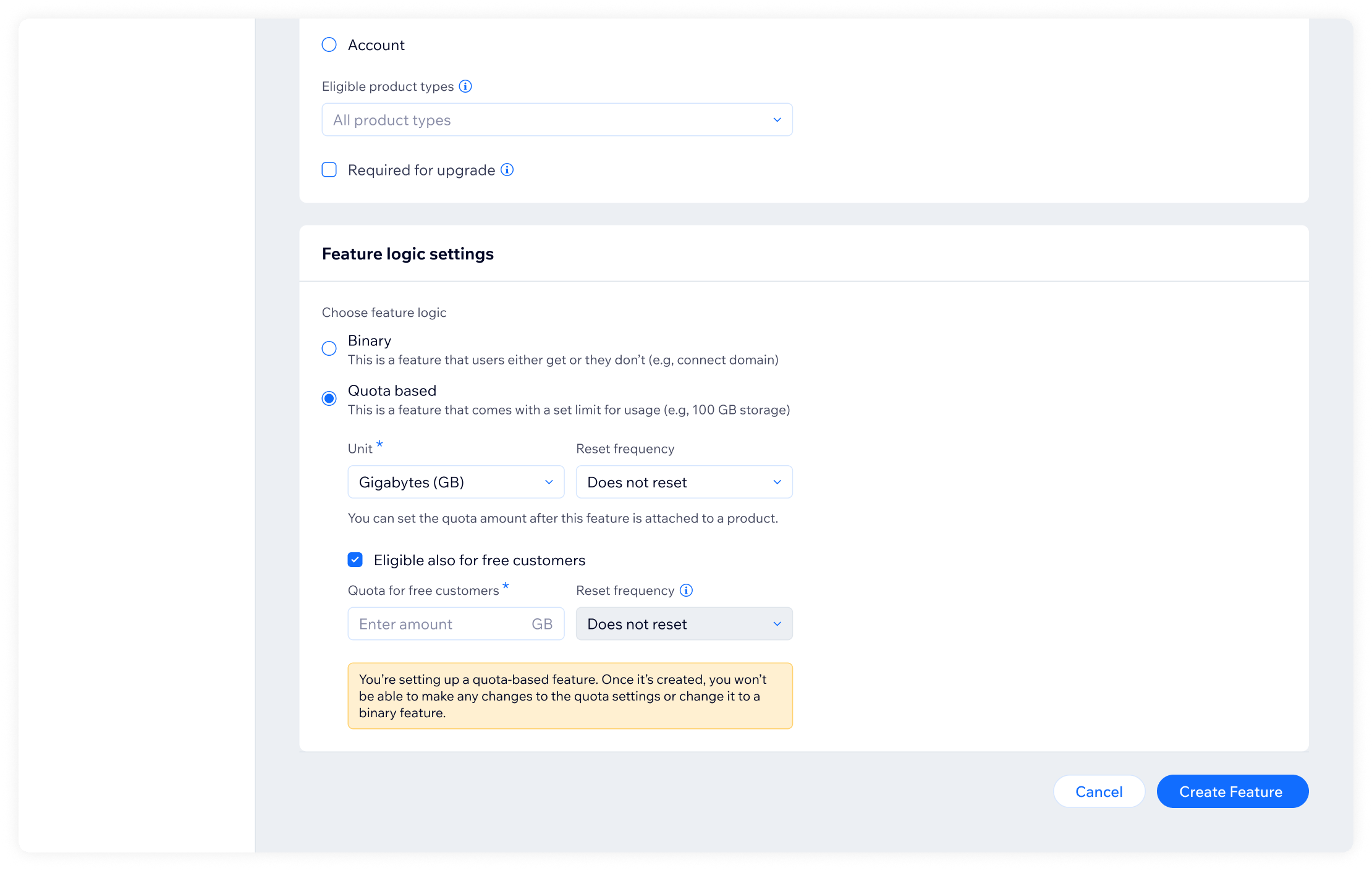
- The feature logic UI didn't clearly communicate when a feature applied to free Wix users, when to paying ones, or the difference between boolean and quota-based logic
After
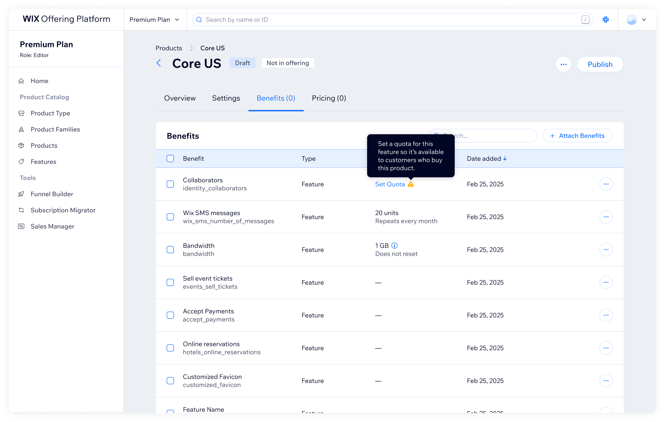
- Merged all three into a single "Benefits" tab. The type distinction is preserved in the data model for legacy reasons, but consumers are guided to work with features
- Added a warning for features where the paid-tier quota hasn't been configured beyond what free Wix users get. When setting it up, consumers can see the free-tier value alongside the one they're setting
- Rewrote how feature logic is presented entirely - the goal was to explain it the way you'd explain it to a friend who's never encountered it before
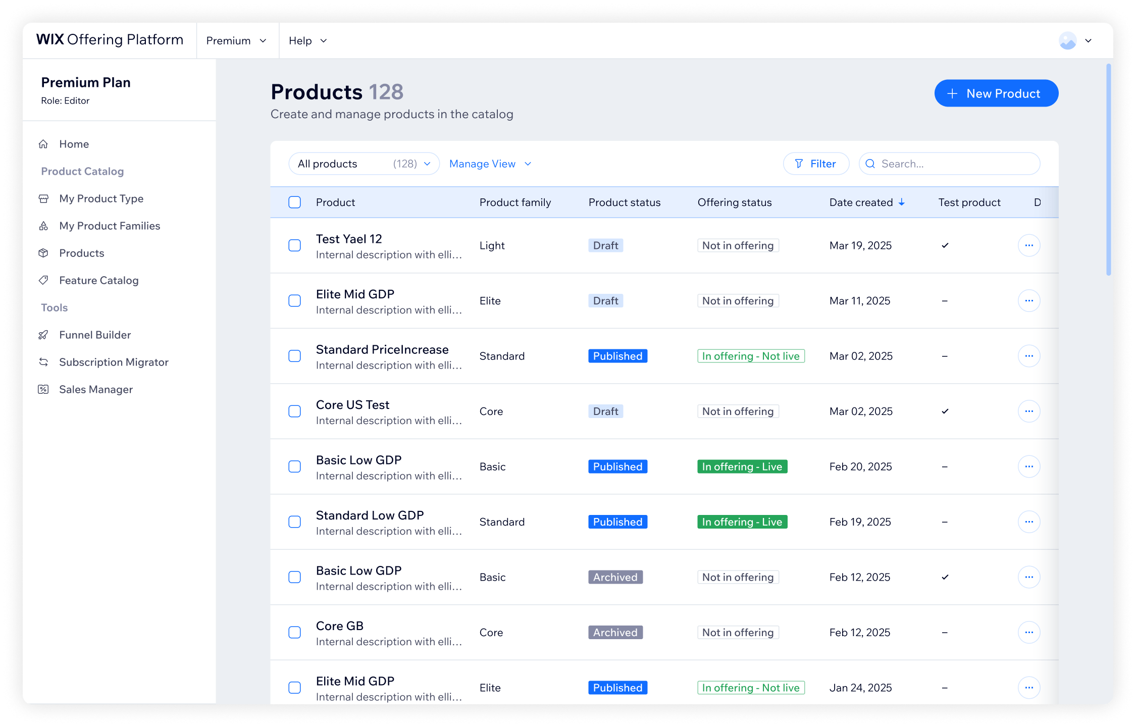
Product table - filtering, search, and saved views
The product table is the entry point - how you find and scan across hundreds of products.
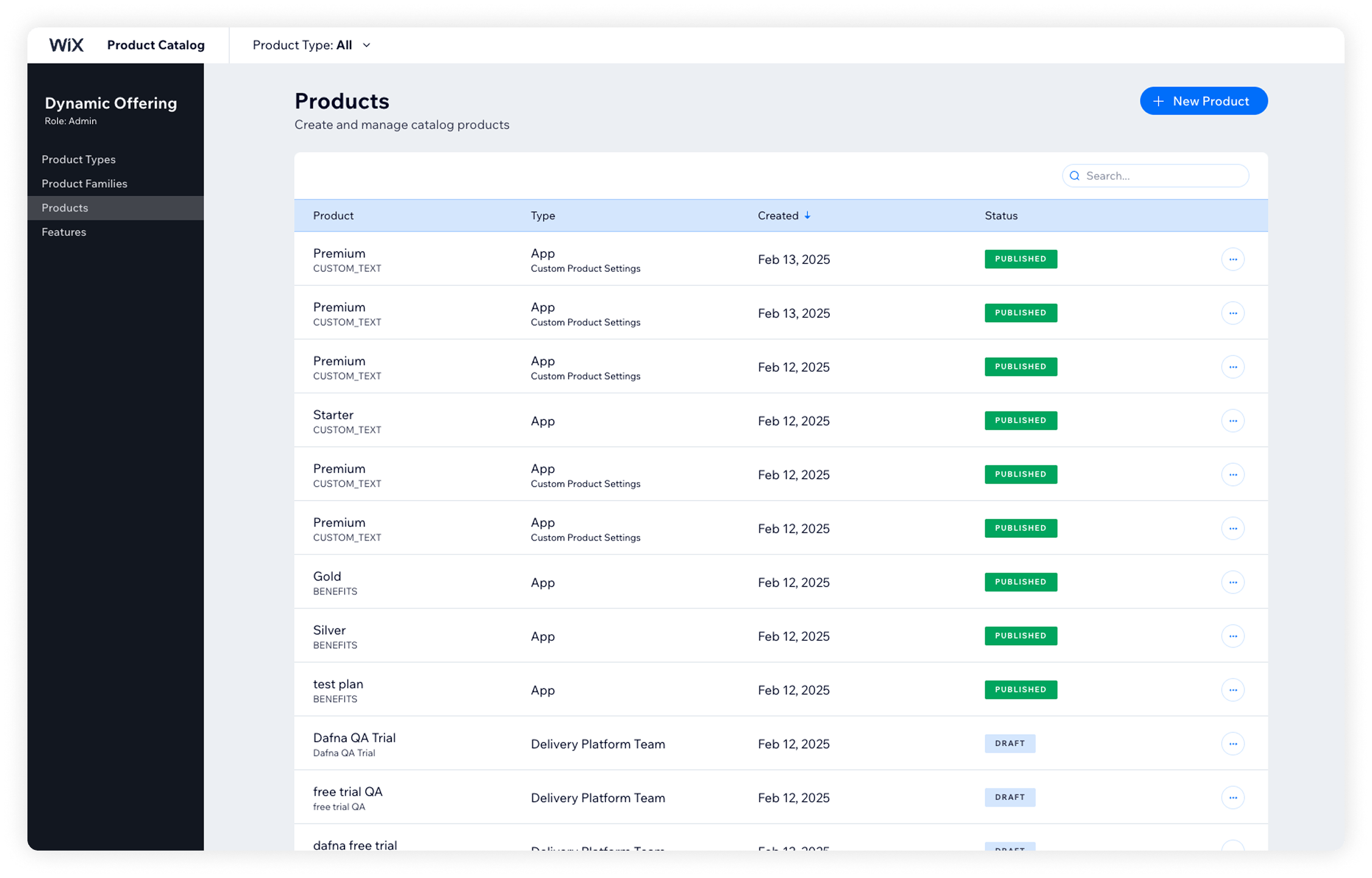
Before
- Column selection didn't reflect what consumers needed - many products looked identical at a glance
- No filtering system, no column sorting, no way to reorder
- Search worked only on exact product names, case sensitive
After
- Added columns with critical product information, including integration status with related platforms
- Brought in per-column filtering, plus filtering by attributes like attached features
- Made search case-insensitive and extended it to product descriptions
- Added the ability to save custom views of filtered results - useful for consumers who regularly work with a specific subset
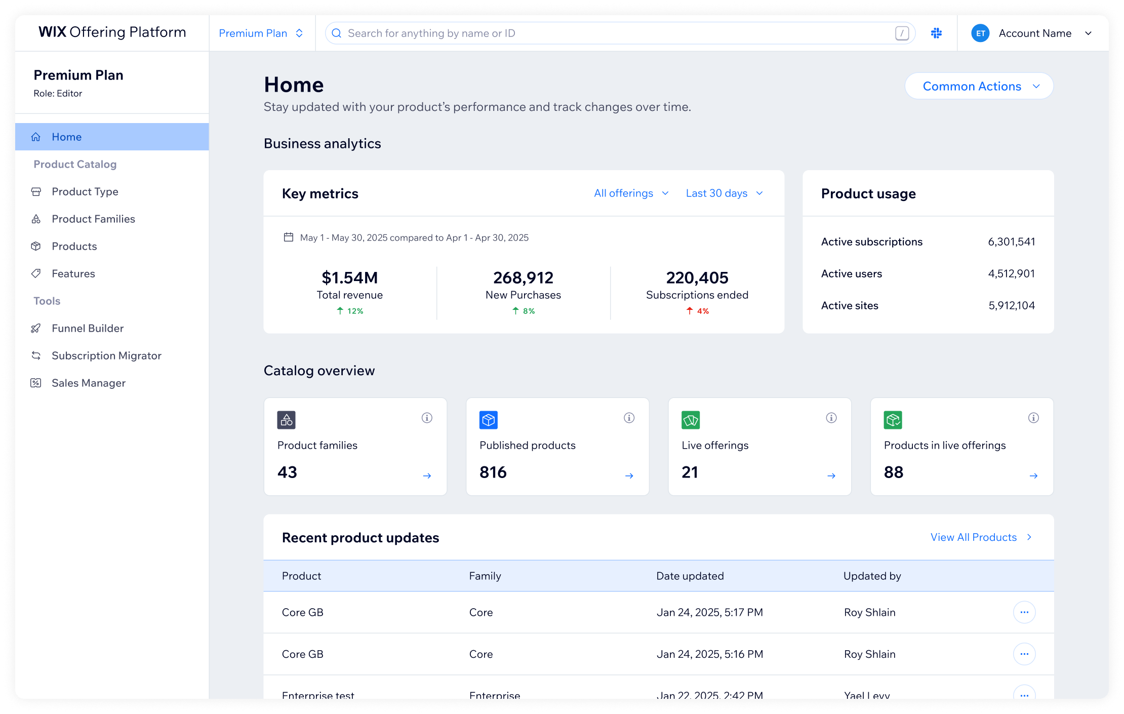
Platform homepage
We added a homepage as a new entry point - a place to see product performance data organized by vertical. It was built modularly so we can extend it as the platform grows.
What changed
The platform is now self-service. Consumers can create and configure products without filing a ticket or waiting for a developer. Also, when PMs configure their own products, they own the business decisions that come with it - pricing, quota logic, feature logic - instead of describing them to someone else.
For the platform team, it meant getting out of a service role and back to building. It allowed us to focus on the future and develop new features that will accelerate Wix's growth and retention.
What I took away
Making a sensitive platform accessible is as much a writing problem as a design problem. The feature logic section is a clear example - quota, boolean vs. usage-based logic, free vs. paid tiers - the concepts are genuinely complex. The solution wasn't to simplify the logic, it was to explain it the way you'd explain it to a friend on the phone: what is this, why does it matter, what does each option actually mean. That approach drove a lot of the micro-decisions throughout the redesign.
Being hands-on in development meant not choosing between speed and quality. Rebuilding the entire system from scratch meant it shipped with a long tail of bugs. Rather than let that slow us down or accept a rough experience, I fixed dozens of them directly using Claude Code. When you can fix things yourself instead of filing tickets, the bar for experience quality stays high without creating a bottleneck.
Thanks for reading!