Product migration automation
Role Product Designer, UX Writer, front-end developer Team 1 PM, 1 FED, 1 BED
Timeline ~2 months, 2025 Company Wix
Problem
When products in Wix change their offering (for example - initiating a price increase), product managers need to migrate existing users to new products at renewal. That process was too technical, too slow, and too dependent on developers, making it a bottleneck for monetization velocity.
Solution
A self-service tool that lets product managers create and manage migrations independently through a dedicated UI.
Impact
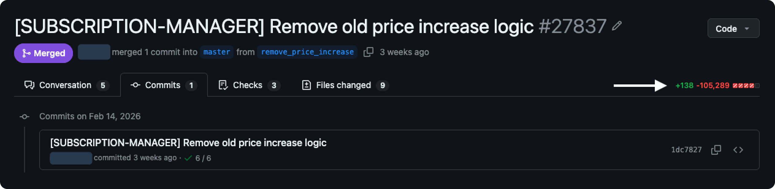
Existing migrations became much easier to maintain, and hundreds of thousands of lines of liability code were deleted. Product teams that never ran migrations before can now do it for the first time, directly increasing the pace of monetization across Wix.
Why product migrations exist
Wix's internal product catalog lets product managers define their offering, set pricing, configure features, and connect them to Wix's billing system. It's used for any product or service that Wix sells to its users, for example: Premium plans, domains, Google Workspace, and many more.
Once a product is published and starts selling, its price can't be changed. More broadly, any change to a product that users have already purchased is sensitive. This internal policy protects existing customers, but it means that if you want to change pricing or restructure the product offering, you need to create entirely new products.
So let's say a PM wants to test a price increase to specific geos - they have to duplicate the existing products, adjust the prices, and run an A/B test. If the price increase works, the new products stay.
That leaves the users who bought the old products. Their subscriptions renew at the original price. At some point you want to migrate them to the new products when their subscription renews, with advance notice. That's the sensitive process this tool handles.
170 segments, 100,000+ lines, and growing
Each migration was configured through its own JSON file in the code repository, maintained by developers by hand. Each "segment" in a file represented a group of users with shared traits (region, user type, subscription status) mapped to a target product they'd be migrated to. A single file could contain over 170 segments and exceed 100,000 lines, full of duplications and inactive data. These files accumulated across the codebase over time, eventually totaling hundreds of thousands of lines of liability code.
The pain points compounded:
Technical and niche
the process required specialized knowledge most product managers didn't have
Developer-dependent
every change required a backend developer
Lack of velocity
adding a single new segment took about a week of manual editing and debugging
Error-prone
very hard to trace when something went wrong
Inflexible
the rigid file structure didn't give PMs enough flexibility in defining their target populations
It was, in every sense, Sisyphean work.
Wix needed to run pricing experiments and product changes faster to grow revenue, and this process was a bottleneck. The goal was to let PMs create and manage segments through a dedicated UI, without touching code or waiting on developers.
4 data types, each with its own prep work
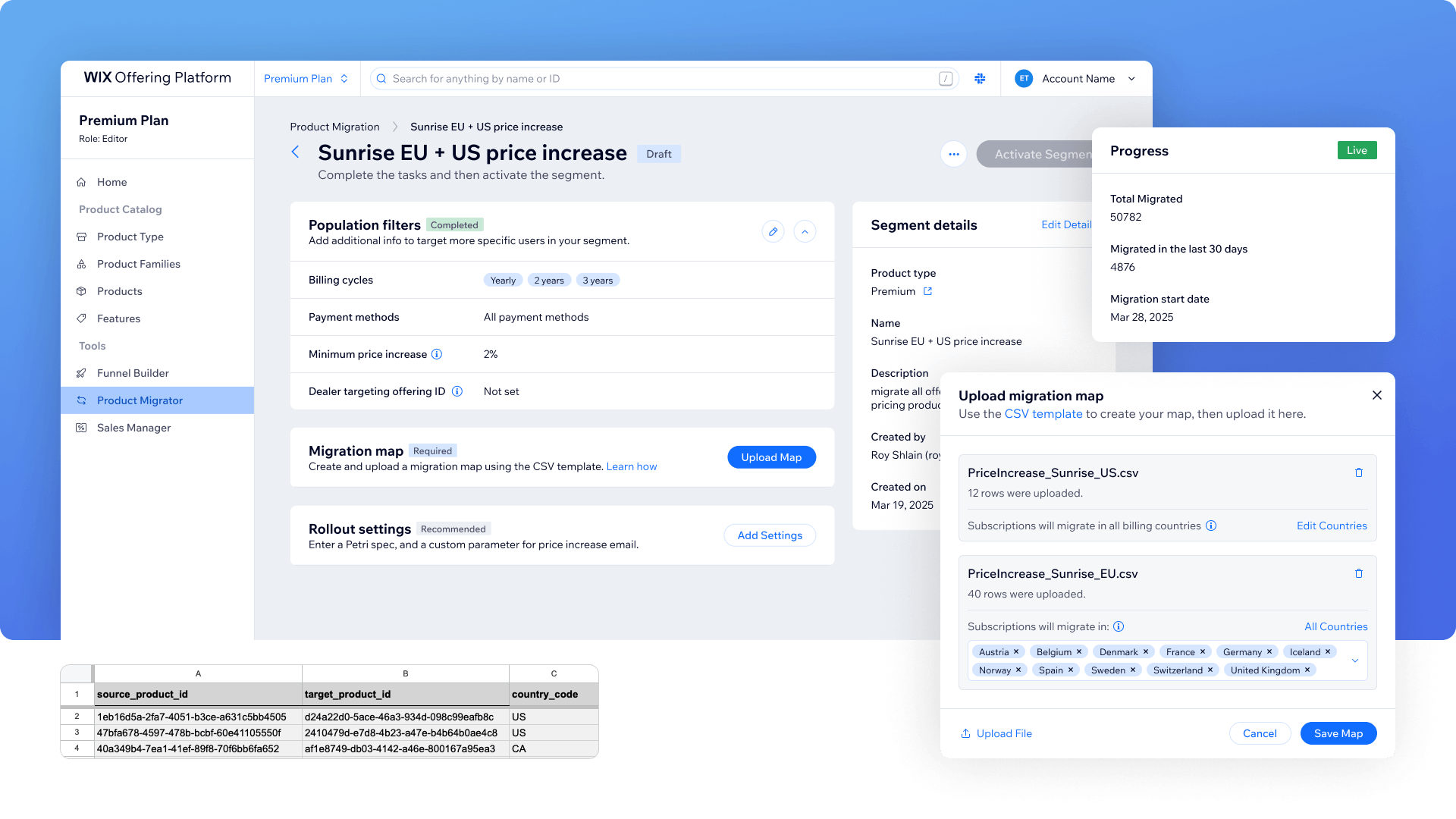
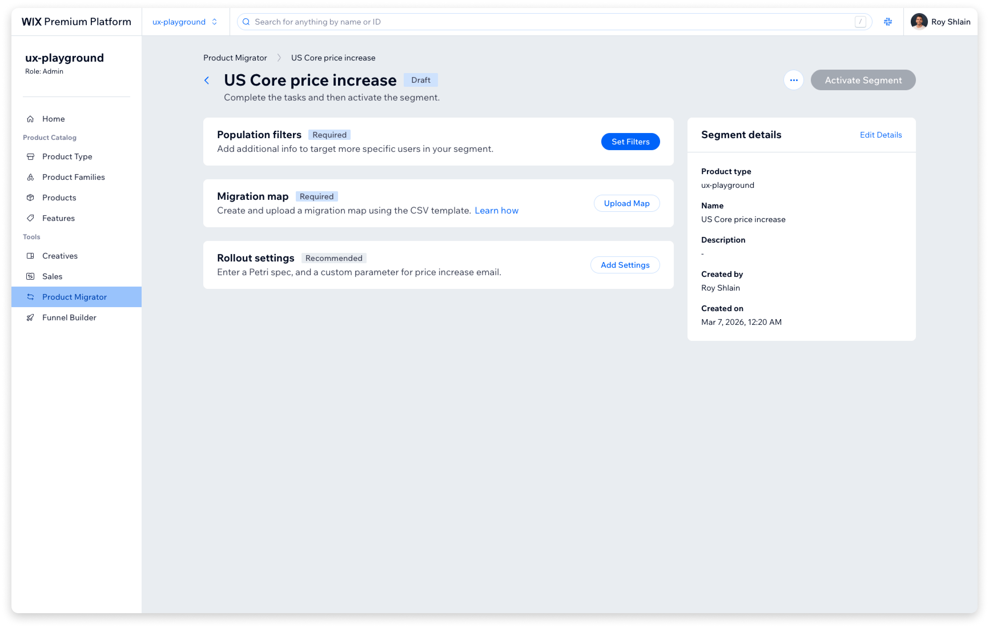
Creating a segment means defining a group of users and mapping them to a target product. I split all of the data a PM needs to provide to 4 sections:
- Segment details: Internal name and description for the segment
- Audience filters: by billing cycles, payment methods, minimum price increase percentage. Additionally, user type filtering happens in a separate existing internal Wix tool. PMs configure the filter there, then paste the resulting ID into our tool.
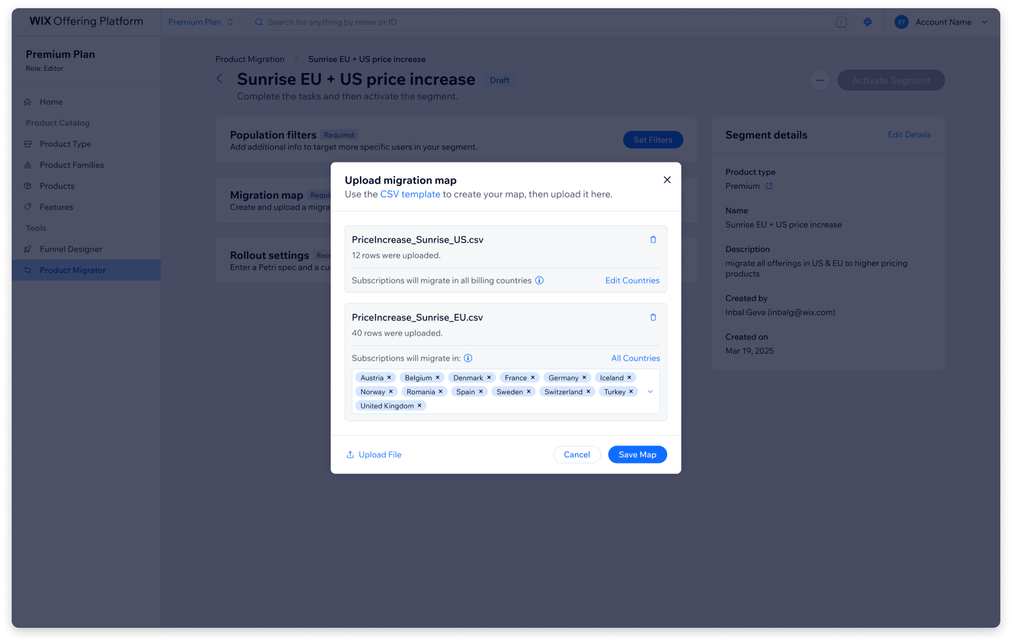
- Product mapping: a CSV file mapping every source product to a target product, per country
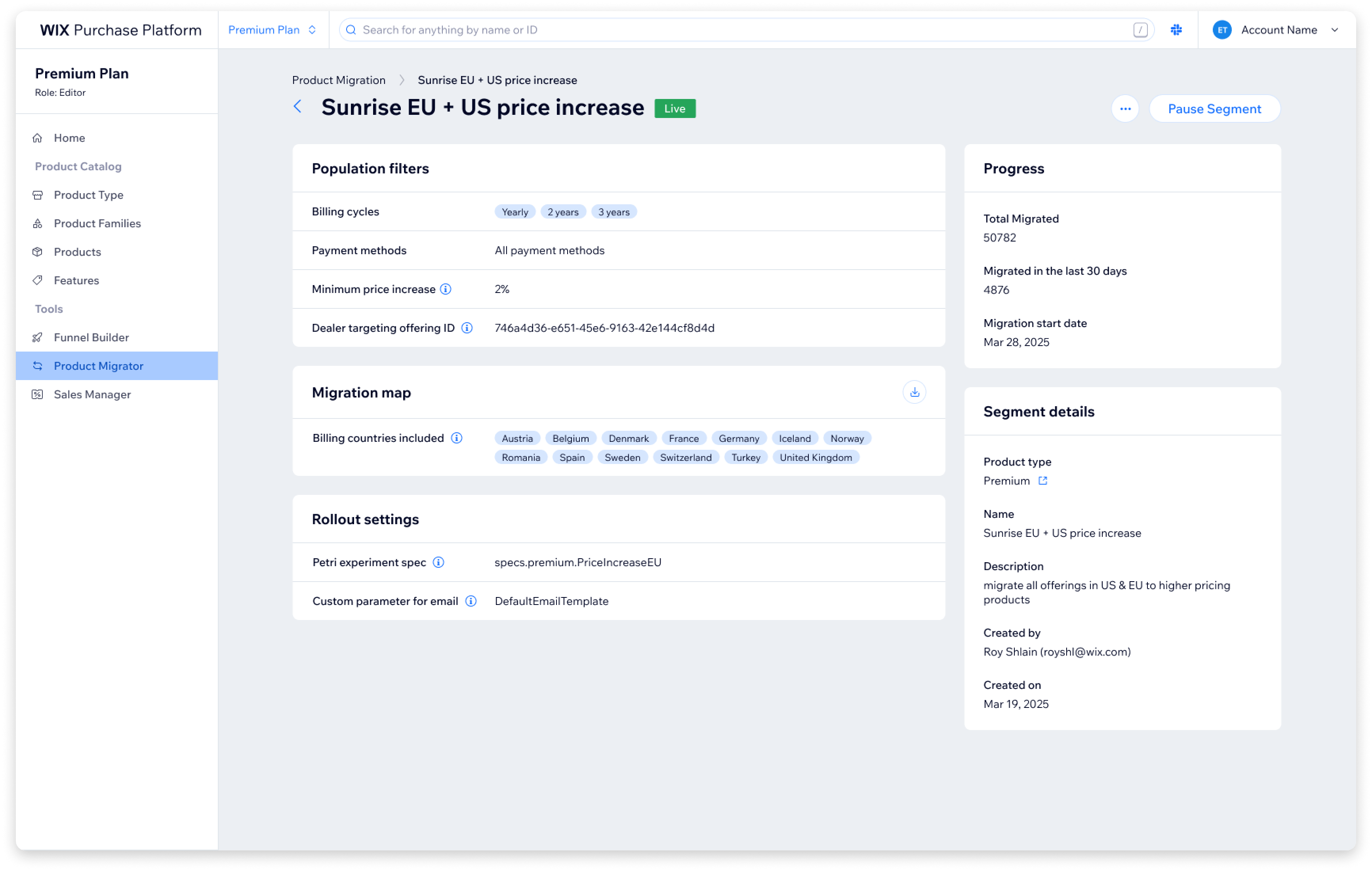
- Rollout settings: whether it runs as an A/B experiment, and the notification email sent to users before renewal
Almost each of these requires preparation outside the tool. The CSV needs to be built in advance. The user type filter, the experiment ID and the email template needs to be configured in another systems first. A PM might spend some time getting everything ready before they can start filling in the form.
2 UX concepts for a complex setup flow
The variety and complexity of the data made it clear we'd need to break the process into steps. We explored two directions.
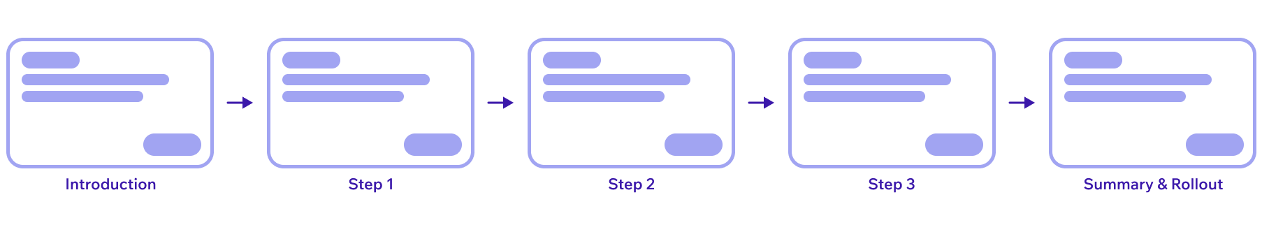
A linear wizard
PM fills one step at a time, reviews a summary at the end, confirms.
- Simple navigation, clear focus on each step
- But assumes you can finish in one session. PMs might need days to prepare, stopping mid-flow means losing progress, and it doesn't support collaboration - someone like a business analyst can't jump in and handle a specific step
- The PM can only preview their full progress at the last step. Any edit means going back to a previous step and stepping forward through the rest again
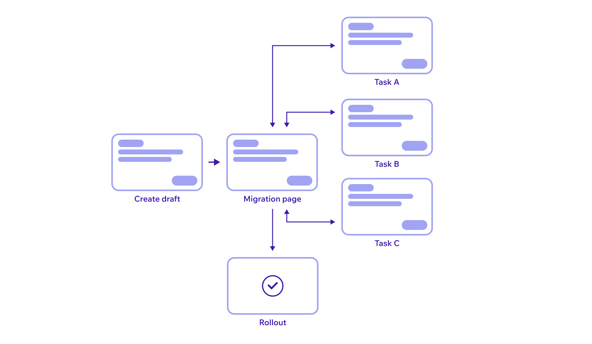
A non-linear migration page
PM creates a draft segment, then lands on a page containing all remaining tasks. Any task can be completed in any order, at any time, by anyone on the team.
- Flexible, supports collaboration, no lost progress, room for the prep work each step demands
- The same page works for creation and later as a read view - with different actions available depending on the segment's status
- But the tab-based design raised two concerns:
- Navigation between tabs might confuse users (would they check the status widget?)
- There was no single place to review all entered data
We chose the non-linear approach based on explicit tradeoffs. The flexibility was critical for this use case. But the two concerns were real, and we decided to test them before committing.
Running usability tests with AI tools
This was the first time I used AI end-to-end for a usability test.
I built a full interactive prototype in Base44, replicating the Figma designs with all the logic, scenarios, and edge cases users would encounter. This gave us something much closer to a real product than a static prototype.
For test planning, I built a bot that took our product and design spec as input and helped us define what to test: research questions, hypotheses, test flows, and success criteria. It generated a solid starting point that we refined for our needs.
For the test script, we fed the bot successful scripts from previous usability tests along with our planning conclusions. It generated a draft script we then adjusted.
This bot became a reusable tool for future tests across my team.
After the sessions, I built a separate bot for synthesis. It took all transcripts, notes, quotes, and observations from every session and organized them into three categories: general observations worth noting, moments where users succeeded and felt confident, and moments where users got stuck, confused, or lost. It also caught patterns across sessions and surfaced quotes I might have missed on my own.
What the usability tests taught us
What worked well
- Each individual step was clear on its own - users understood the instructions and moved through fields without friction
- Tooltips were in the right spots and genuinely helped people avoid getting stuck
- PMs were genuinely excited when they finished this complex process successfully
What didn't
- Tab navigation hid progress - users moved between tabs but rarely went back to check the status widget, so they didn't know when they'd completed everything or when they could activate the segment
- "Activation" was unclear - users didn't understand what the button meant and didn't expect a confirmation modal to appear
- Power users preferred the old CSV format - the new tool introduced a new template for product mapping uploads, but PMs who had done migrations before were used to the old format and asked us to keep it as an option
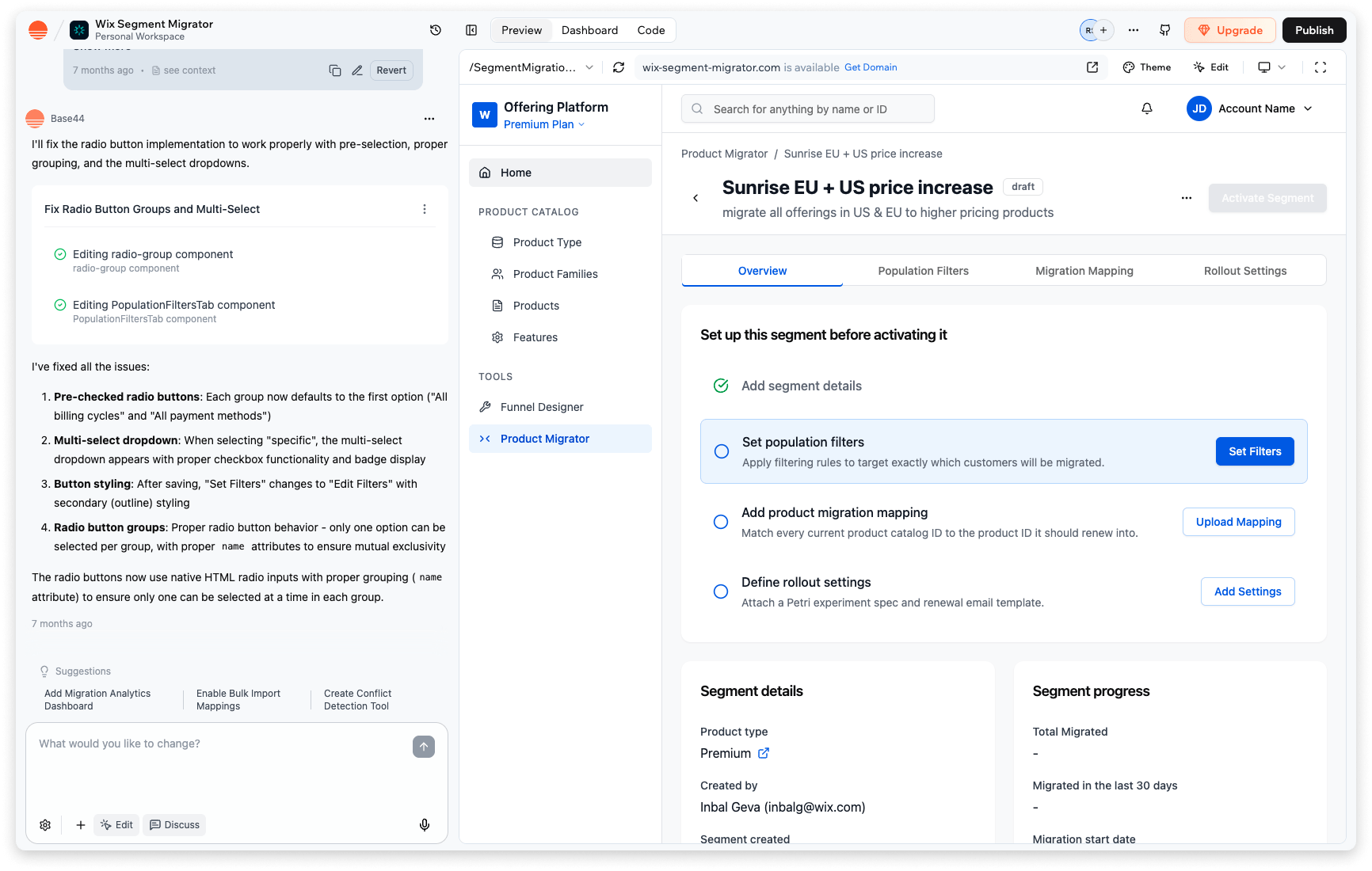
How testing shaped the final design
We kept the non-linear approach but removed the tabs entirely. Every change traced directly to a usability finding:
- All tasks on one page - progress is always visible, no need to check a separate widget
- Modals for editing - PM opens a task, fills it in, closes the modal, and returns to the full view
- Expandable completed cards - PMs can review all entered data from one place without navigating between views
- Activation tooltip - hints at what will happen before clicking, so the confirmation modal isn't a surprise
- Legacy CSV template support - power users can upload the old format, and the UI adapts its behavior when it detects it
- FAQ section - common questions that came up during testing were addressed directly in the UI
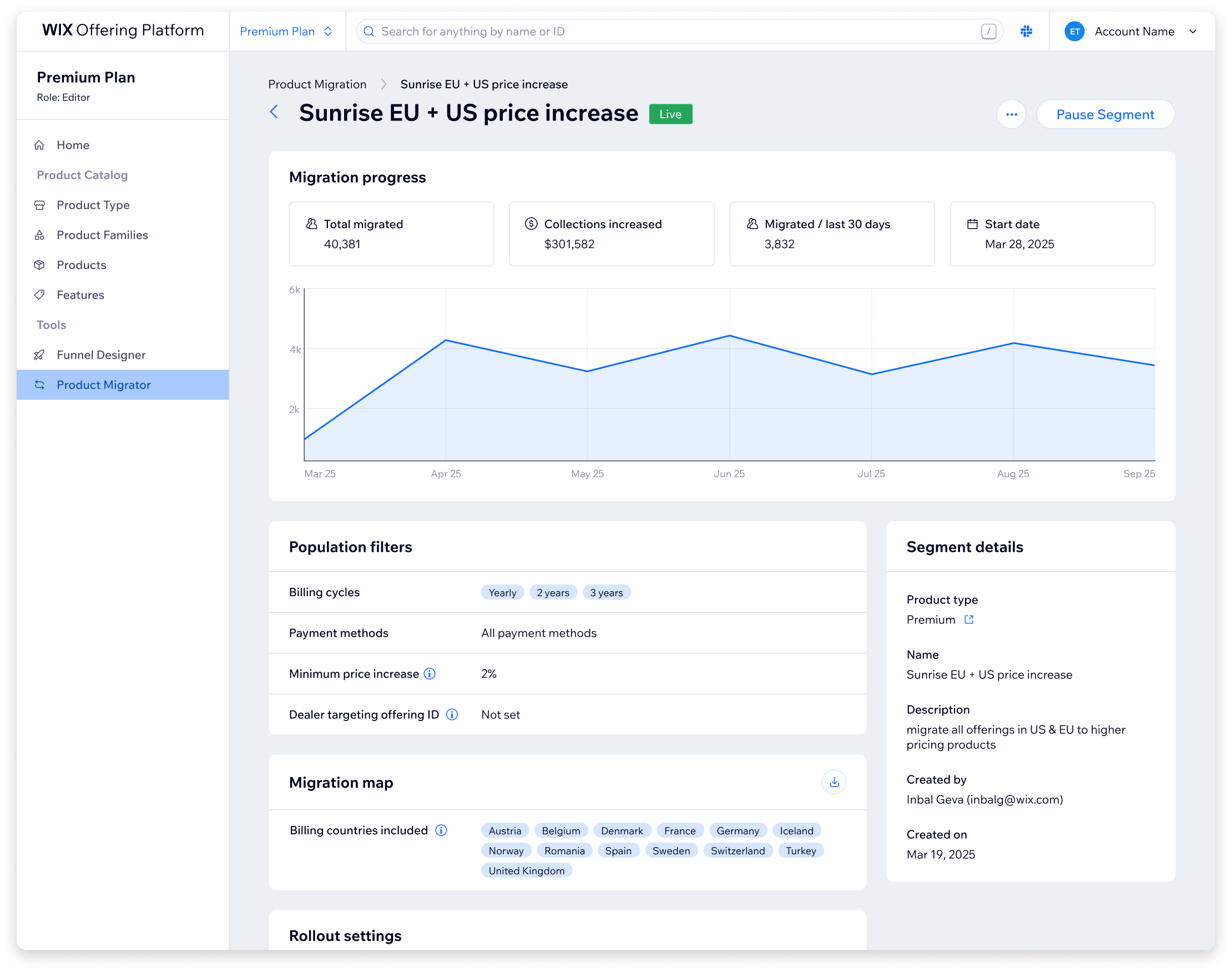
Outcome and impact
- The tool is live and available to all product teams across Wix.
- The legacy JSON configs it replaced were removed from the codebase, and with them hundreds of thousands of lines of liability code that had accumulated over years.
- Product managers no longer need to file tickets or wait for developer availability to create or modify migration segments.
- Some product teams that had never run migrations before have already used the tool to run their first ones.
Going forward, the most meaningful metric would be how many new pricing A/B tests this tool enables across Wix product teams. That's the whole point: making the process intuitive enough that more teams actually use it to test monetization. Beyond that, I'd track time to create a new segment (from roughly a week to what should be hours) and error rate compared to the manual process.
What I took away
AI-assisted usability testing - It saved time on preparation, caught user patterns across sessions I might have missed, and surfaced quotes I wouldn't have found reviewing transcripts manually. But I also learned where to draw the line. The bots organized and generated. Every actual decision stayed with us. I shared the methodology and the bots with the rest of the UX designers in my department.
Test your assumptions - We had a real concern about the navigation. Testing confirmed it. If we hadn't tested, we would have shipped a navigation model that confused our users.
Hands-on development - I built parts of the UI myself, which helped us roll out faster and made UX QA much quicker. When you can fix things directly instead of filing tickets, you insist on experience quality without slowing the team down.
Cross-functional negotiation - Throughout the project there were many technical discussions with backend developers about feasibility and scope. We found compromises that worked for both sides without degrading the experience.
Thanks for reading!

