Purchase funnels tool
Role Product Designer, UX Writer, front-end developer
Team 2 PMs, 2 FEDs
Timeline ~4 months, 2025-2026
Company Wix
Problem
Every product team at Wix with a new monetization initiative had to build its purchase funnel from scratch. Multiple teams, months of work, and the result looked almost the same every time. It was one of the biggest bottlenecks slowing down revenue launches across the company.
Solution
A three-layer platform that gives each vertical what it actually needs: raw data and infrastructure for full-custom builds, smart components for flexible branded flows, and a constrained editor that lets product managers launch a complete purchase funnel without development.
Impact
Verticals that previously waited months can now reach a working purchase funnel in less than a day. For example: Wix Studio rebuilt with the smart components. Social Media Marketing and more sub-products in Wix went live in days using the editor. Wixel used the SDK for a fully custom UI.
Wix was scaling, and every initiative hit the same wall
While I worked on Wix's Premium platform, the company entered a period of growth and acceleration. Alongside existing core products, new initiatives were multiplying: AI tools, internal startups, new verticals with monetization goals, and business partnerships with external companies. Each one eventually needed to reach the same moment - charging money.
Getting there wasn't simple. It required connecting to Wix's billing, permissions, packages, notifications, and analytics - both from a regulatory and legal standpoint and from a business efficiency standpoint. Our team on the Premium platform held the knowledge for this entire process. We accompanied every new monetization initiative on the business side and the technical side.
Every funnel was built from scratch, and they all looked the same
One of the biggest bottlenecks in launching a new vertical was the purchase funnel. Each time, it was a long, branching project:
- Design its own screens from scratch
- Write new business logic for pricing, plans, and checkout flows
- Develop all the different flows, edge cases and error states
- Request support from Premium's dev team to connect billing and payment services
- Get input from PMM on pricing strategy, metrics, and business rules
The pain points were clear:
Slow time to market
setting up funnels was dev-heavy, with complex integrations requiring deep Premium knowledge
Missed best practices
funnels were implemented differently, omitting what we'd already learned about monetization and conversion
Inconsistent experiences
every Wix product ended up with a different purchase funnel, with no uniformity across the brand
After watching this cycle repeat, we couldn't ignore the pattern. The business model varied between products, but the basic flow was almost always identical. The design and branding sometimes changed, but the components looked and behaved the same way, with the same logic underneath. Every vertical was rebuilding something that already existed.
We needed to take all of this accumulated knowledge and turn it into a system - a unified set of components that contain the critical business logic, so verticals wouldn't have to reinvent it every time.
3 layer platform for 3 consumer types
Different verticals had different needs. Wix has sub-companies and sub-brands with their own design language - a single solution wouldn't work for all of them. We built the platform as three layers, each serving a different level of control.
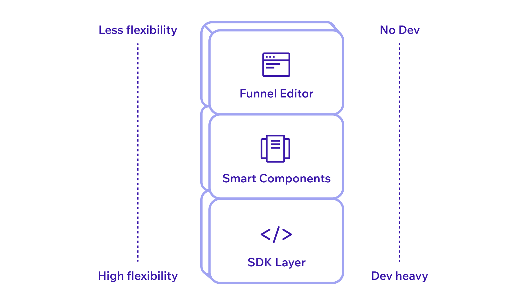
SDK (data layer)
For sub-brands and products with a unique requirements. They get all the data they need to sell products - package names, prices, offering-to-country mapping, features per package - and build the UI themselves. Our infrastructure, their design.
Smart components
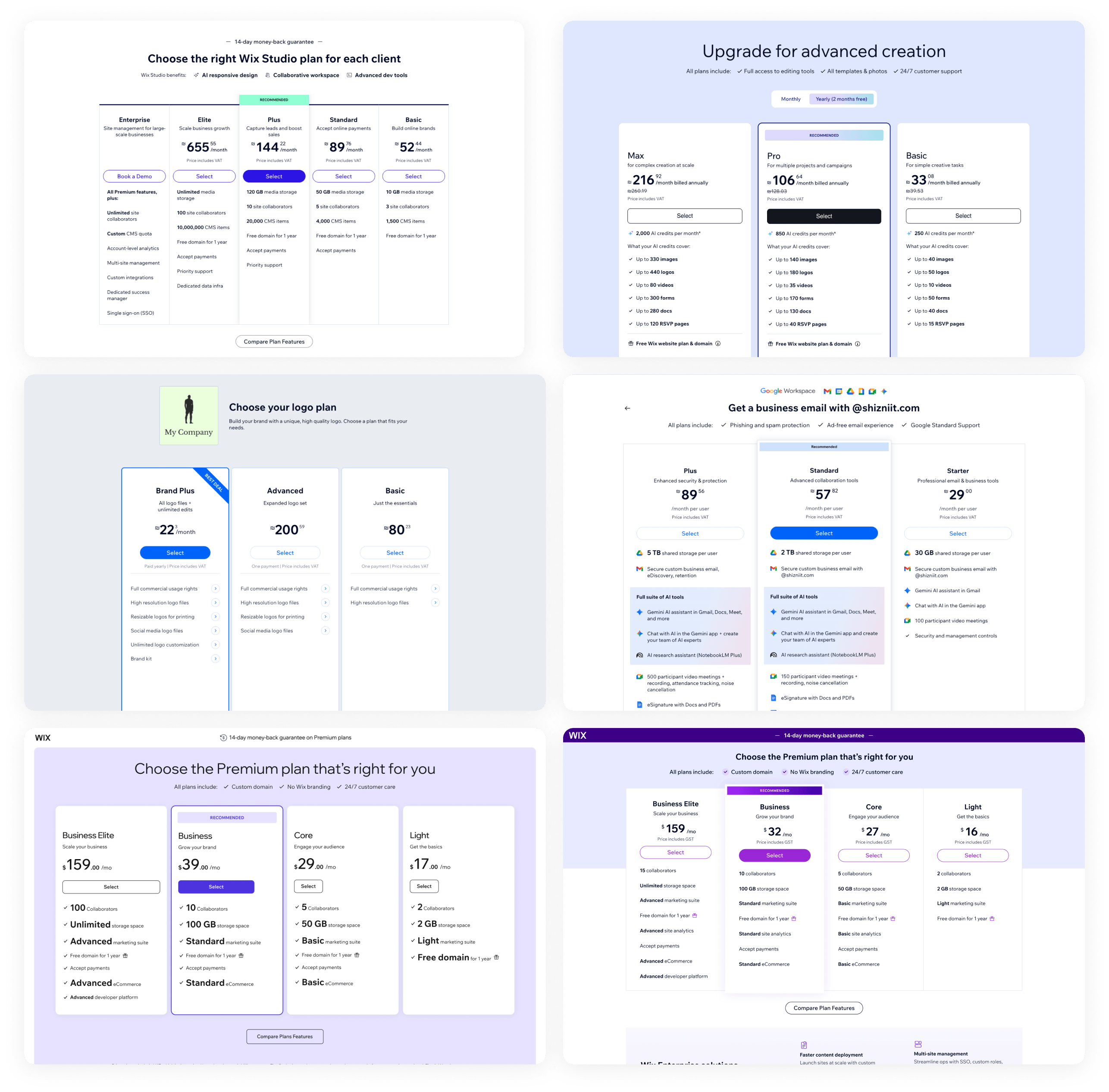
For products that need their own branded design. Each component is flexible enough to match any brand, but comes with business logic already built in - plan comparison, billing cycle selection, FAQ section, checkout. Teams can use them independently or combine them like building blocks, and develop quickly because they're not starting from zero.
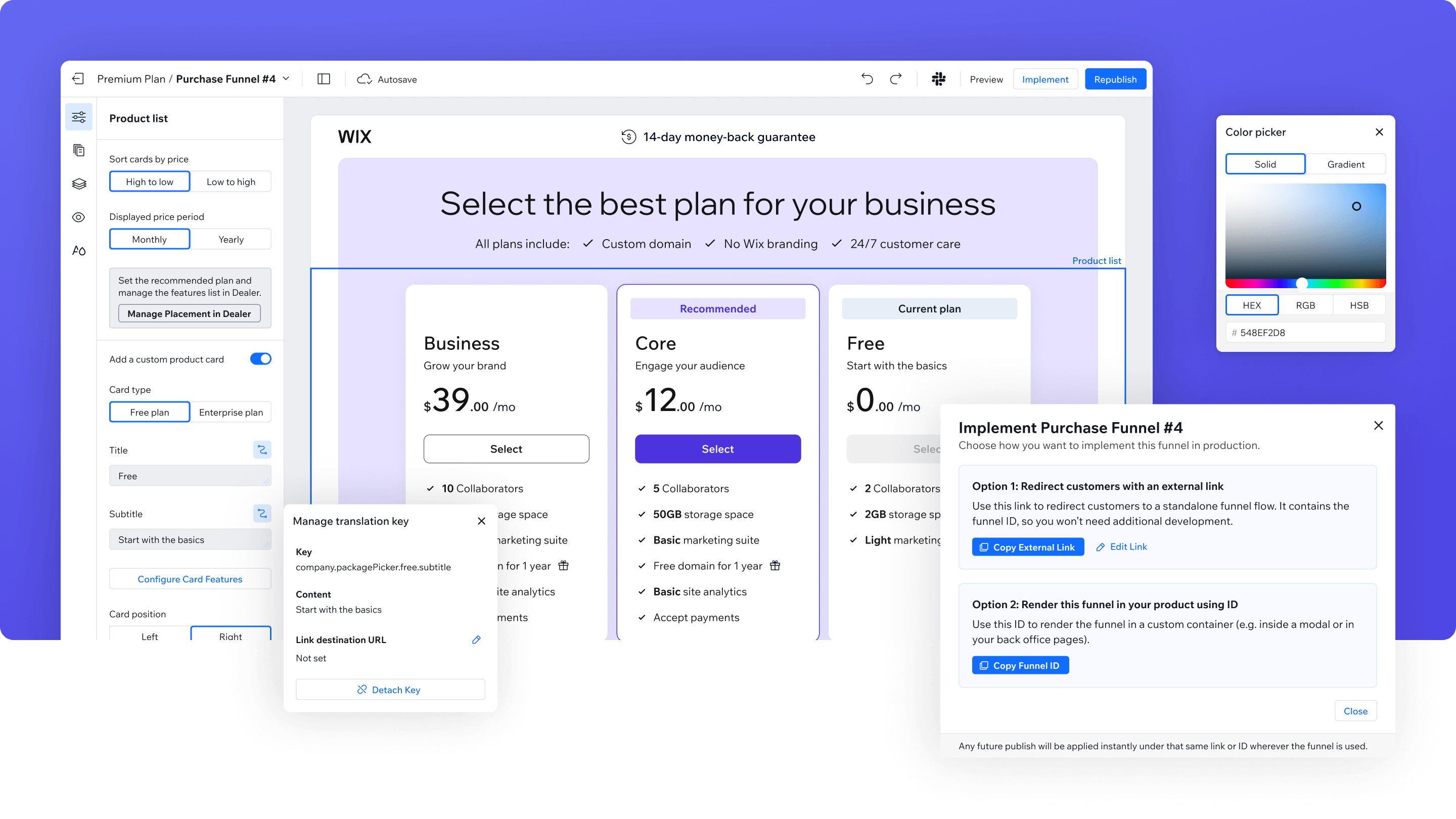
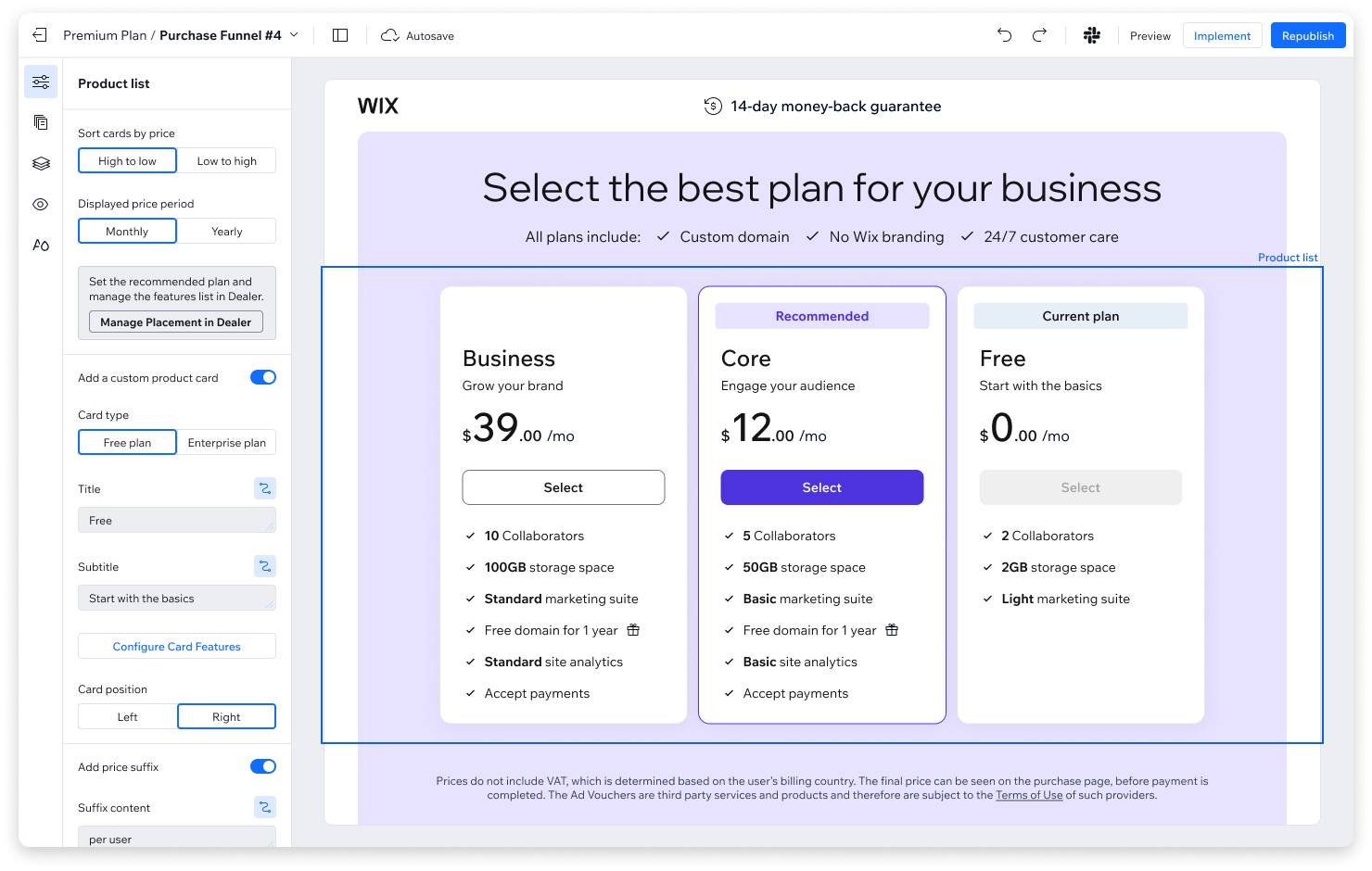
The editor
For Wix-branded products that don't need distinct design. A no-code funnel builder that lets PMs rapidly create purchase funnels, test monetization hypotheses, and reduce time to market. A product manager gets a designed, out-of-the-box template, personalizes it with their content and component variations, and gets a working funnel pre-populated with their product catalog data. No code, no design file - just a URL they can use directly or embed on their page.
Building the component library
I defined each component's capabilities, built them, and made them accessible through Figma and Storybook. The goal was to give verticals something they could pick up and use immediately - browse components in Figma, customize the design for their brand, and develop quickly because the logic and responsiveness are already built in.
The hackathon that taught us what not to build
The SDK and components covered most use cases. But some verticals didn't need that flexibility - they just wanted something that works out of the box, fast.
We tried to solve that with an editor, built in a week-long hackathon. The initial idea was an AI-based editor - generate a purchase funnel through prompts. But the pace was too fast. We didn't properly define each component's capabilities or boundaries. We didn't talk closely enough with the people who'd actually use this. We worked mostly on gut and curiosity.
The result was a mess:
Capabilities that weren't fully defined
half-baked features that confused more than they helped
Too granular control
the editor gave you a front-end level of customization, overwhelming and unnecessary for most people
Non-technical people couldn't use it
the product managers who were supposed to use this thing couldn't figure out how to work with it
We had built an editor that only its creators could understand. After the hackathon, we realized AI generation was redundant here anyway - most funnels looked the same. The value wasn't in generating new layouts. It was in making the common patterns easy to assemble and customize, with clear constraints. That's where we pivoted.
Designing the editor around guardrails
The hackathon taught us that more options don't help if they're not well-defined. For the real version, I designed the editor experience, the customization capabilities, and the funnels management flow. The question behind every decision was the same: what do PMs actually need to control, and what should the system handle for them?
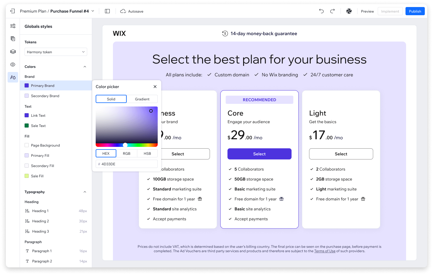
We worked with the design guild to define how purchase experiences should look across Wix products. For anything under the Wix brand (not sub-brands), there was no good reason for each to look different. The editor enforces these guidelines by default.
What pms control:
- Flow structure - which pages exist and how steps are split
- Component variations - choosing between layouts we've already validated
- Content - copy, images, and value propositions
What the system handles for them:
- Responsiveness across devices
- Spacing and typography hierarchies validated across existing purchase flows
- Integration - the funnel connects to Wix's billing, checkout, and payment services out of the box
We wanted the editor to feel familiar. Every Wix employee builds a site when they join, so the mental model of a simple design tool was already there. We drew inspiration from the Wix Studio editor, for the content we studied existing purchase funnels that performed well, and kept talking with consumers throughout. The goal was to be even simpler than what they already knew.
Beyond the editor itself, three things made it strategically right for Wix:
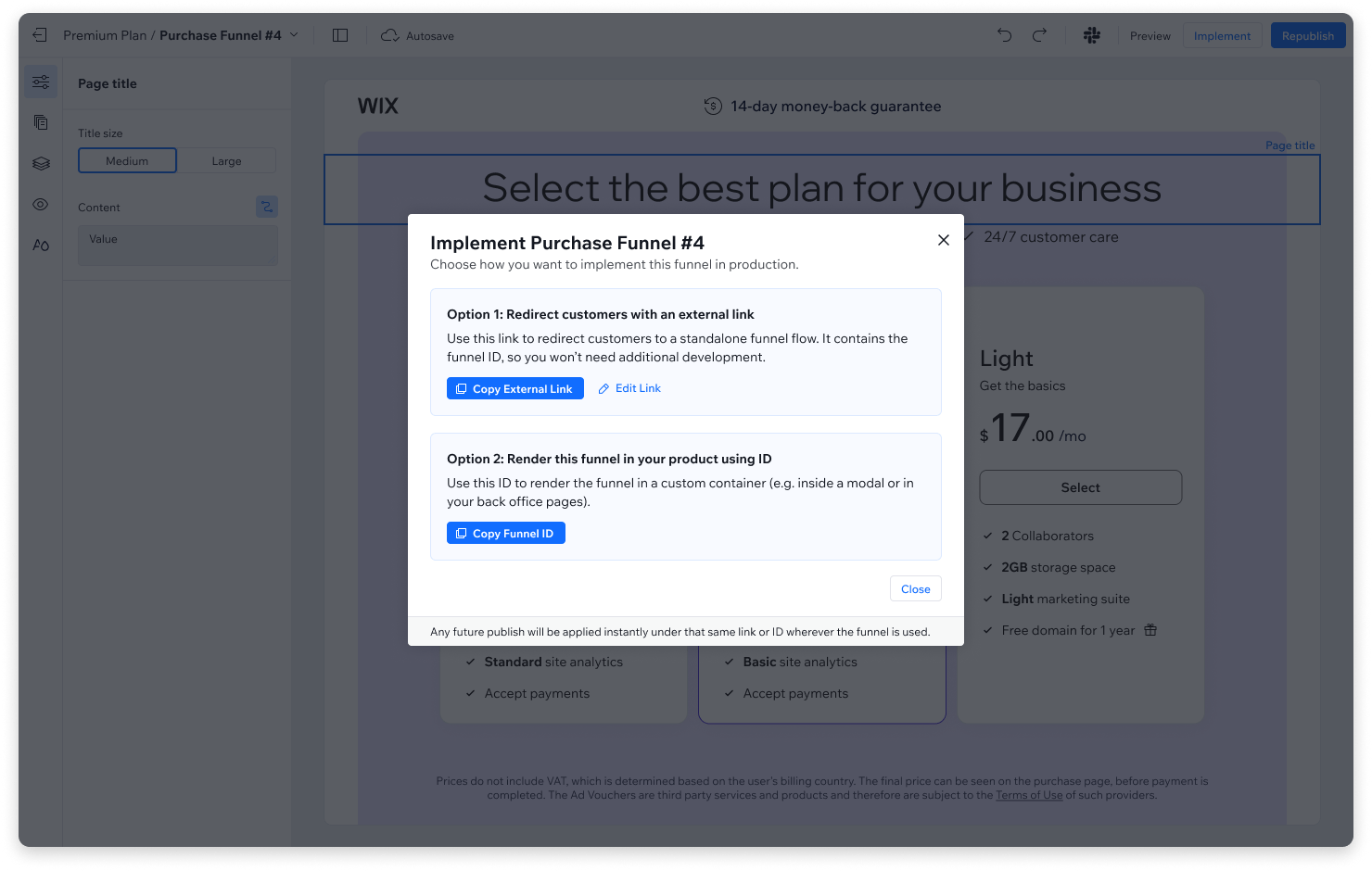
Zero dependency on design and dev
a PM can create a purchase funnel that meets Wix standards, start to finish, without filing a single ticket
A/B testing in minutes
duplicate a funnel, change one thing, mark both for an experiment. Teams can optimize conversions and revenue weekly instead of waiting for the next sprint cycle
Years of knowledge built into the defaults
the template reflects what we've learned from building purchase flows across Wix. New teams start with patterns that already work instead of repeating old mistakes
Three consumers, three different paths
The real test of the architecture was whether different verticals with different needs would each find the right fit.
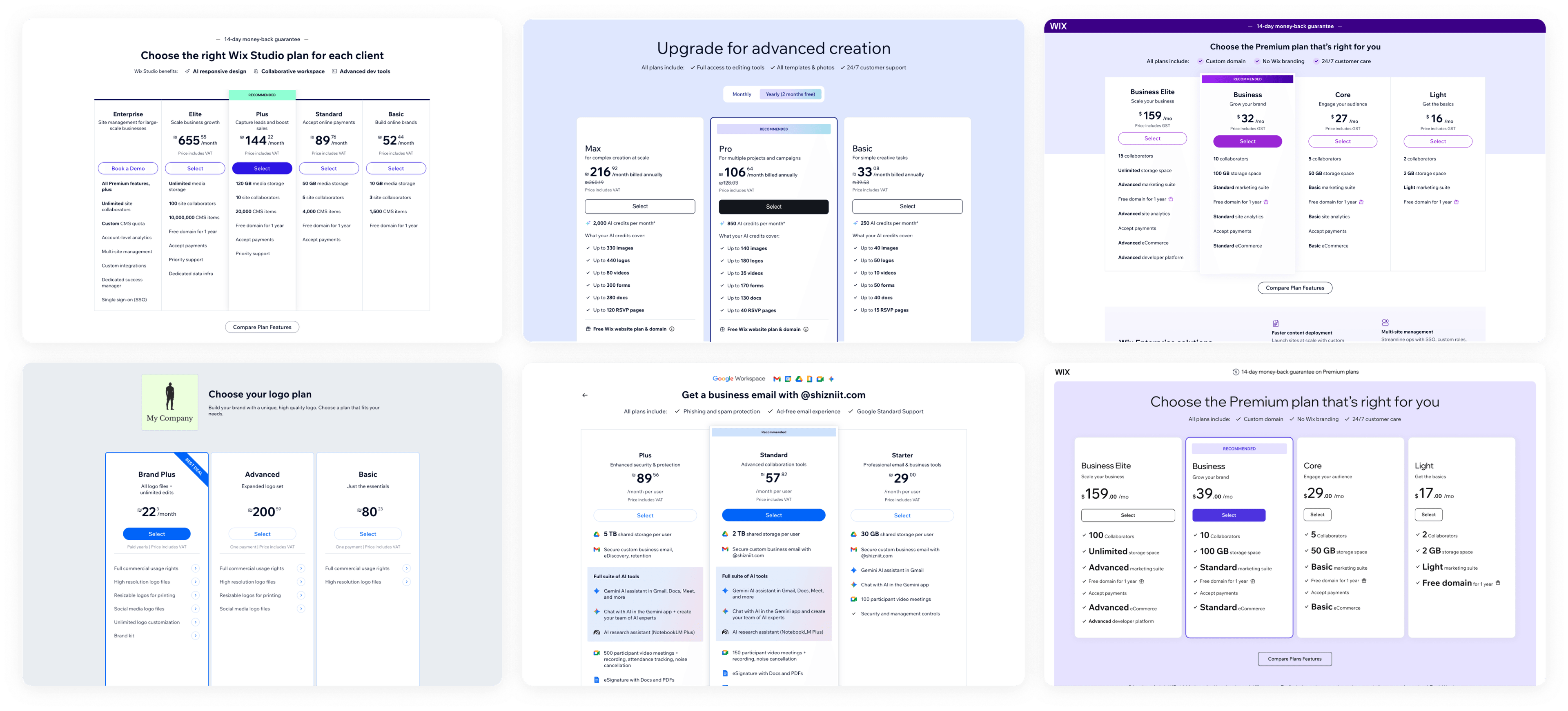
Wix Studio rebuilt its purchase flow on the smart components layer. Studio has a distinct brand, so it couldn't use the editor's templated design. But the components gave them a flexible foundation - they customized the look while keeping all the logic and infrastructure.
Social Media Marketing, a Wix product vertical, needed to launch fast and didn't need distinct branding. They used the editor and went live in a matter of days. No custom development and no extra design work.
Wixel had a brand new component language that our system couldn't support visually. They used the SDK for pricing data and plan names, and designed the entire UI on their side. When it came time for checkout and payments, they connected to our APIs. Full freedom on the surface, shared infrastructure underneath.
Each vertical found a different entry point into the platform, and each one launched faster than the old process would have allowed. The architecture held because it wasn't designed for one use case - it was designed to absorb variety.
What I took away
Meet users where they are, not where you want them - Our first instinct was to build one thing that works for everyone. But we kept running into the same friction - some teams wanted full control, others wanted to move fast with zero customization. Trying to serve both with one tool meant serving neither well. The three-layer architecture came from accepting that instead of fighting it.
Removing choices is a design decision - The hackathon editor failed because it offered everything and guided nothing. The version that shipped removed most of the options and made the remaining ones obvious. I keep coming back to this: sometimes the most impactful design decision is deciding what people can't do.
Shared infrastructure changes the conversation - Before the platform, when a vertical came to us about monetization, the answer was "you need to build a purchase funnel." After, we could walk them through three options and help them pick the one that fits - that's a fundamentally different starting point.
Going forward, I'd track two things: how many new verticals launch monetization through the platform instead of building from scratch, and how many A/B tests teams run on their purchase funnels per week. The first tells us if the architecture is doing its job. The second tells us if teams are actually using the speed to optimize revenue, not just to ship.
Thanks for reading!

